Danish Power Data Pipeline
- My work
- Data engineering & ML
- Status
- Live dashboard & daily forecasts
- Core stack
- Dagster · TimescaleDB · LightGBM
- Result
- 30M+ rows · 116× query speedup
A production data platform for the Danish electricity market: every night it ingests day-ahead prices, wind & solar forecasts, CO₂ intensity and household consumption for the whole country — over 30 million rows spanning 5+ years — and serves them as a live analytics dashboard and a daily Telegram briefing. Every morning a machine-learning model predicts the next day's 24 hourly prices before the market auction closes, and its accuracy is scored publicly as the official prices land. Runs 24/7, deploys itself on every git push.
The problem
Danish electricity prices swing hard — hour to hour, and sometimes below zero when wind floods the grid. The raw data is public (energidataservice.dk), but it lives in five different datasets with different time grains, an aggressive rate limit, and a market format that changed mid-history (hourly to 15-minute settlement in October 2025). Turning that into one clean, queryable, always-current database — fast enough to power a public dashboard — is a real data-engineering problem, not a download.
How it works — the flow
- 1 · Ingest (Dagster) — four orchestrated assets, one per dataset (prices, production forecasts, CO₂, consumption), each split into monthly partitions from 2021 to now. A scheduler re-materializes the current month every night at 21:45, so late-arriving data heals itself.
- 2 · Fetch, defensively — the public API rate-limits bursts hard, so the fetch layer batches windows into few large calls and retries HTTP 429 and network failures with long waits. The price asset transparently stitches together the old hourly dataset and the new 15-minute one across the 2025 market switch.
- 3 · Load idempotently — every row lands via batched upserts (INSERT … ON CONFLICT DO UPDATE) keyed on timestamp + dimension, so any partition can be re-run any number of times without duplicates. The initial 5-year backfill ran as 85 resumable jobs with state tracking — a mid-run Wi-Fi drop cost a rerun command, not a restart.
- 4 · Store as time-series (TimescaleDB) — four hypertables partitioned into monthly chunks. Columnar compression shrinks 6 GB to 563 MB (10.7×), and continuous aggregates pre-compute the daily/hourly rollups the dashboard needs.
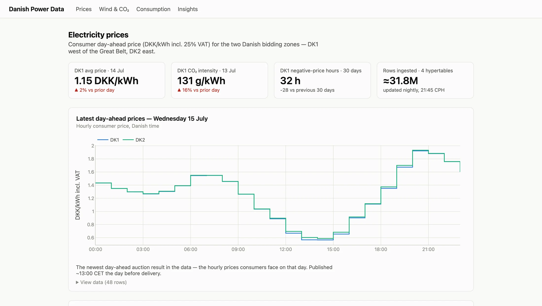
- 5 · Serve — a Plotly Dash app (KPI tiles, price heatmap, a choropleth map of all 98 municipalities, market-insight charts) reads only the pre-computed aggregates through a read-only database role. The heaviest query dropped from 2,195 ms on raw rows to 19 ms — a 116× speedup. A Telegram bot sends tomorrow's prices and the cheapest 3-hour window every evening.
- 6 · Predict (LightGBM) — each morning, before the 12:00 day-ahead auction, a gradient-boosting model forecasts tomorrow's 24 hourly prices. The features are leak-free by construction: price history, point-in-time weather forecasts and the previous gas settlement — the grid operator's own wind forecast publishes only after the auction, so it is deliberately excluded. Validated by walk-forward backtesting over 24 months: mean error 0.19 DKK/kWh vs 0.29 for a naive tomorrow-equals-today forecast (−32%). Every prediction is stored as an immutable record tied to a git-versioned model file and scored on the dashboard once the auction result lands.
Architecture
- 01Public dataPrices, forecasts, CO₂ & consumption
- 02DagsterPartitioned ingestion & idempotent upserts
- 03TimescaleDBCompressed time-series & aggregates
- 04Dashboard & briefingPlotly Dash & Telegram
Forecasting: point-in-time price, weather and gas features → LightGBM → stored daily forecasts → scoring against auction results.
Everything runs in Docker on a self-managed VPS: a TimescaleDB container (no published ports, private network only), a stateless Dagster daemon whose run history lives in Postgres, and the dashboard behind Nginx with Let's Encrypt TLS. GitHub Actions is the deploy pipeline: every push to main runs the test suite, then SSHes into the server, rebuilds both images and recreates the containers — zero manual steps. Secrets stay in server-side env files; the dashboard's database role can read but never write, so a compromised web app cannot touch the pipeline's data.